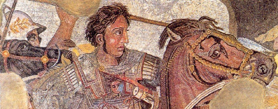
In his Second Oration Concerning the Fortune or Virtue of Alexander the Great, Plutarch describes Alexander as having a ‘slightly bent’ neck (see here). What may have been a physical deformity became in Alexander’s own lifetime part of his iconography with his court artist Lysippus making no attempt to disguise it.
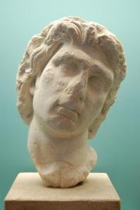
During the Hellenistic period, various kings imitated the crook, occasionally with a little too much effort, as Mithridates VI (135-63 BC) shows here.
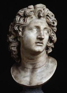
There are numerous examples of Alexander with his neck ‘slightly bent’. Here is one:
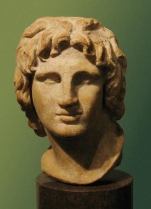
One famous bust of Alexander, however, where he is not shown with a bent neck is the British Museum’s. This is how it is displayed to visitors:
As you can see, his head is quite straight. But notice that his neck on your left is angled outwards. A week or two ago I noticed this and it got me wondering - is the British Museum displaying the bust as it was originally intended to appear or have they ‘straightened’ it?
I don’t know the answer to this question. One thing I am certain of, though, is that if the bust was attached to a body and Alexander’s head was conceived of as being, and carved, straight then the body would have to be angled, as if in motion. I’m sure of this because I have tried to replicate the position of the bust in my bathroom mirror and it can only be done by sloping one shoulder and raising the other, as if running.
Alexander’s head, however, does not look like the head of a man in a hurry. I suspect, therefore, that whoever carved this bust meant for his head to be angled as a result of his crooked neck. During a quiet moment at my office the other day, I used the Photos App on my mobile ‘phone to see if I could recreate the crook. Here’s a second version that I did on my tablet for this post:
I apologise for the close-up nature of the photograph - I could not get the iPad to save it in any other way. That aside, what do you think of the picture? When I first saw it on my mobile ‘phone, I thought it made Alexander look much more tender, almost feminine, than when his head was straight (or, dare I say, erect). I have to admit, though, I really like the bust this way. It is still familiar yet in a way completely new. The leonine toughness of Alexander remains yet the tilt makes him so much softer. I must be honest - this version of the bust makes me love Alexander in a way that I didn’t before.
I could be completely wrong about whether the bust was meant to tilt or not but if it was why would the British Museum show it straight? I wonder if it was indeed because whoever decided on its position wanted to emphasise the tougher Alexander over the gentler one. What do you think? I would be very interested to hear your thoughts.
Photo Credits
Mithridates: Alchetron
Alexander (black and white): Emaze
British Museum Bust of Alexander: Wikipedia


I wonder if his neck was slightly bent or if he simply leaned to one side. His eyes were also described as dreamy-eyed, one light colored, one dark. I wonder if his vision caused him to lean a bit to see! I have always wondered at Philipp’s one eye when a warrior.
LikeLike
Oh, and as far as your making the British museum’s statue lean to one side, I think Alexander would hate it. He disliked any form of femininity in his soldiers.
LikeLike